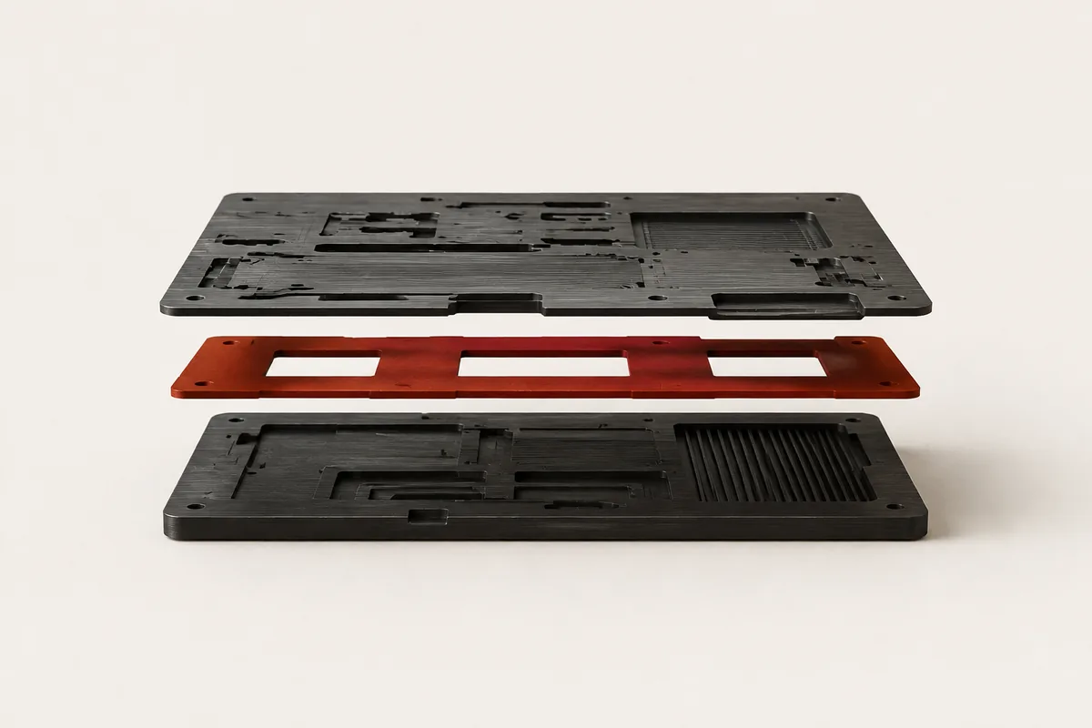
React UI Kit / Component Library / 2026
ObsidianKit
ObsidianKit is a clean, modular React component library designed to build obsidian-themed markdown notes, dashboard grids, and publishing portals. Designed for high performance, custom styling, and layout efficiency.
Visit project
The project.
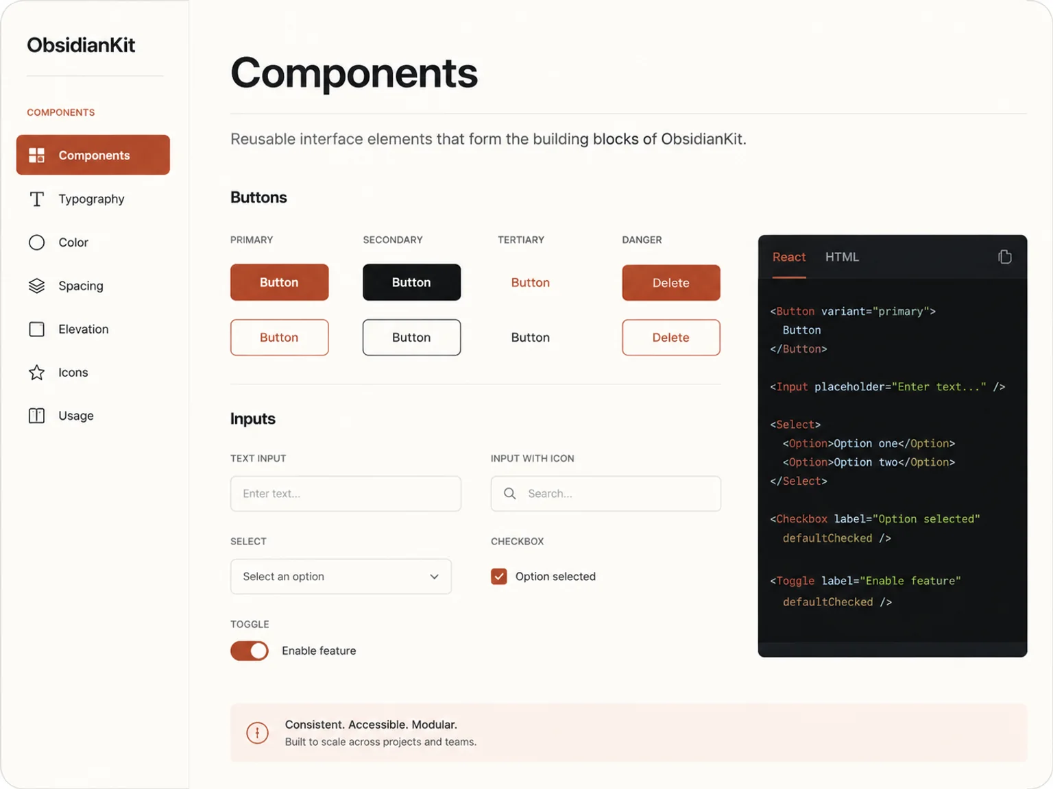
ObsidianKit is a refined React component library built for developers who want to create clean, high-performance web applications with a tactile, editor-inspired aesthetic.
It integrates modular component structures, markdown layouts, and dark-mode optimization out of the box, allowing you to launch documentation portals, blogs, and publishing sites in minutes.
Designed for Flexibility and Customization
Every component in ObsidianKit is built using semantic structures and is styleable with Tailwind CSS. It supports custom typography, theme tokens, and layout presets, giving you absolute control over your note-taking or publishing application.
Tactile Visuals
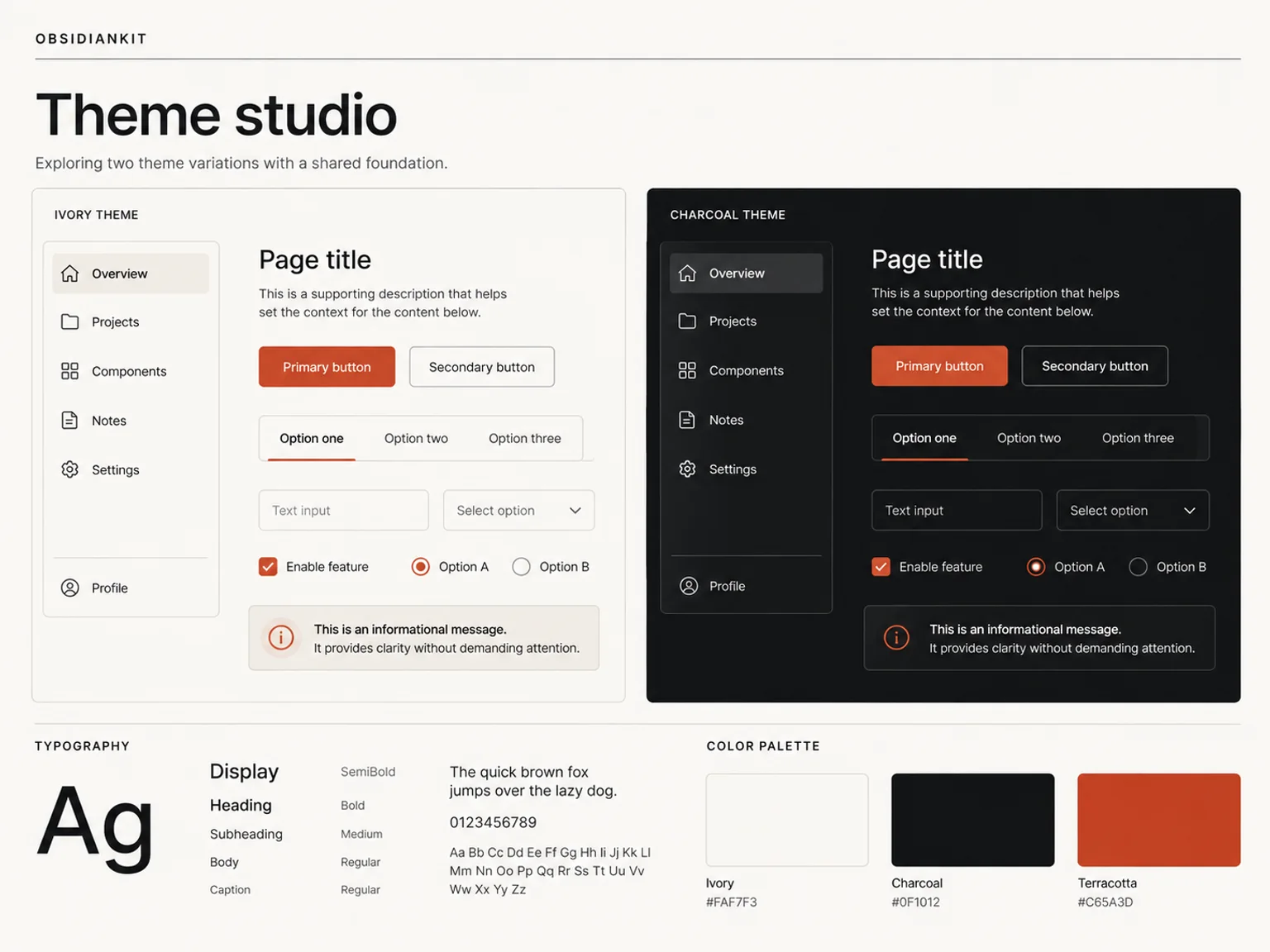
ObsidianKit uses a high-contrast layout system. Thin, clean borders define each section, while generous margins and negative space keep the design breathing and readable.
The colors are locked to neutral tones, allowing text content and visual components to carry the visual weight.
Content First
The components are designed to present complex documentation and nested lists elegantly. From sidebars to tables of contents, everything is structured logically.
Users can navigate through nested pages with speed and visual comfort.
Production Ready
Fully typed with TypeScript, optimized for lightweight bundle sizes, and tested across modern responsive viewports to ensure seamless user experience.
Ready to Scale
Whether building a personal knowledge base or a corporate wiki, ObsidianKit provides the building blocks to support expanding documents.
Absolute Performance
No heavy bundle sizes or complex states. Designed with standard React APIs, it remains highly responsive under any document load.